
01
Project Challenges
To resolve user issues in recharging plans/subscriptions.
To help business attaining goals to propose entertainment centric propositions.
To improve present matrix of overall experience.
02
My Role
Led design, worked with researcher, Business team, PMs, Analysts and Developers.
17%
20%
34%
Drop off after plan page decreased

01
Early insights
From website’s recharge journey funnel, we understood that huge user traffic is landing on plan page but majority (+30%) of users were dropping from plan page.


02
Help consumers make better & informed decision
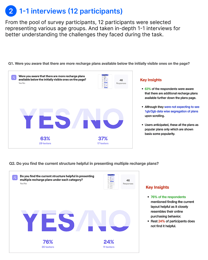
We explored why users drop off the plan page by testing plan cards with 49 users (usability test) and 12 users (interviews), alongside our UX researcher Shrutika. The goal: understand browsing behavior and improve how plans are discovered and viewed.
Key research questions
What is the user’s understanding of current plans page?
2.How user explore and locate the desired plan?
3. Evaluate whether users are utilising the accordion feature to access various plans?
4. How do they find current structure for presentation of plans?

Competitive benchmarking
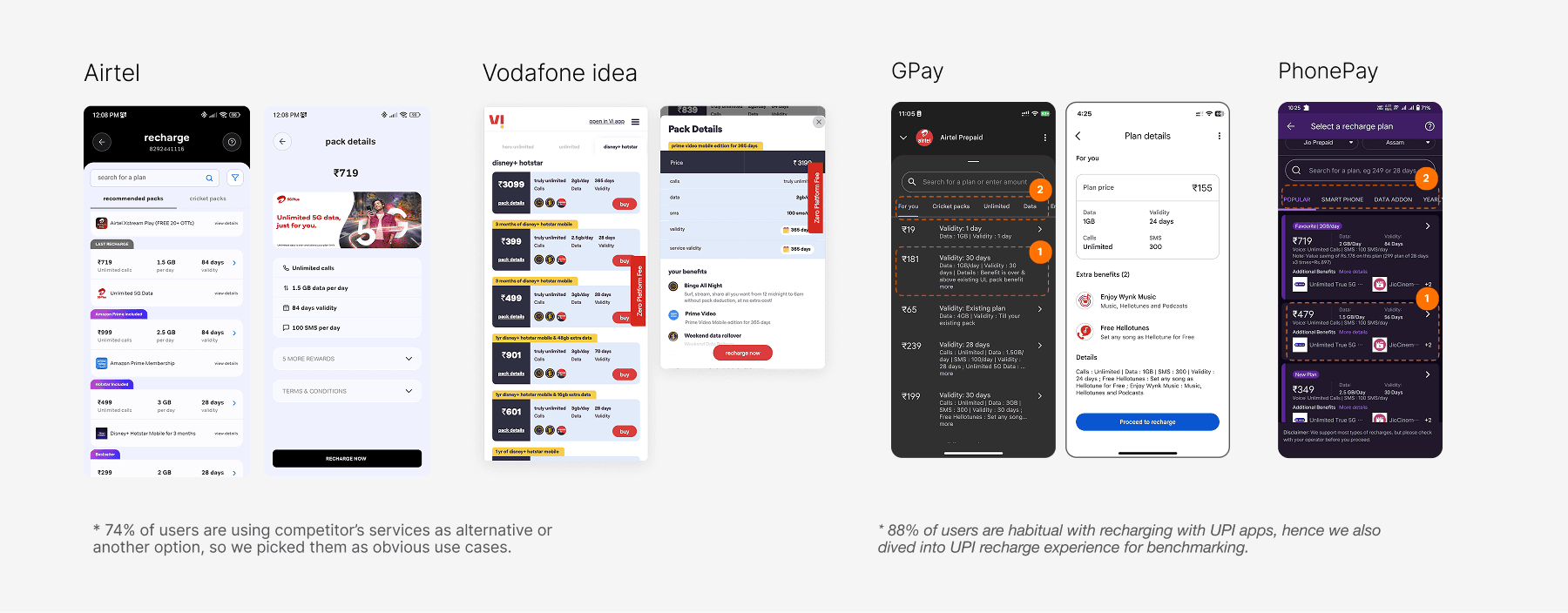
I audited 5 products’ recharge experiences, analyzing plan pages, cards, personalization, and more. I found users struggle with understanding offers and taking action. My aim was to design a seamless, quick experience—free from information overload—that encourages customers to recharge easily and stay engaged with the product.
Key takeaways
Look and feel of card (upfront) is minimal as possible, accommodating more cards on screen.
Detailed view got utilised to its full potential to explain offerings, using different section and images as well.
In few of cases, CTAs are not prominent and loud.
OTT and Entertainment got emphasised in detailed view.
List of plans is readily available in compact format, providing vital info, but gives more info on expansion.
It also helps in exploring plan categories as tabs-scroll.
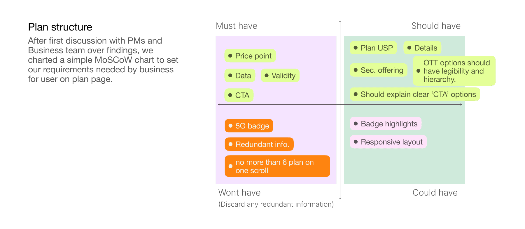
Plan cards structure
Plan cards are seemingly simple but can get fairly complicated when it comes to make even a little change, but in design process i have to solve user issues with stakeholders, since every aspect of plan card affects every aspect of service. It has a price point, offerings, a button for the action and details button in case user want to know more.
User scenarios
With help of qualitative findings, we created scenario, with users picking partial steps based on their requirements and understandings. At any point user should be able to take action to start the recharge journey.

Adding search & sorting
We picked conventional search of alpha-numerics system, But after implementing, users will be able to search plan cards and keywords, but all of search tags are numbers, which raise another challenge for us since search results mixed all categories together, so we introduced ‘Sorting’ feature as layer over category filters.

Personalised options
Mobile app have 72% of successful recharges, but 17.9% of user were facing difficulty in discovering desired plans. To reduce this, we introduced personalised options, since contrary to website, mobile app have user’s inputs as data base, which we leveraged to create personalise options.

Design iterations
I began with prioritising the single card component and scaling into a list of cards, considering all states and information, main challenge is to keep all essential details upfront for user to pick card while also not giving toll to users while browsing.


05
Testing with use cases
Next step was to add more use cases, scaling for other propositions, like JioFiber, AirFiber, IR plans.

05
Final Design


05
Impact with ‘search’ feature
We pushed ‘search’ in mobile app in Jan 2024 and started observing performances.


Testing plan page design
With new design, we again went to user for what they feel about new design, seeking new insights. we tested new page with 62 participants focusing their user challenges on Maze prototype to test what challenges user are facing with new version.

