Project Challenges
IA of current dashboard is limited to its ability to cater emerging needs.
User issues like confusing journey flows and grouping features.
To resolve performance issues like retention rate and search.
Team
Sole Designer, 2 Analysts, 2 PMs, 8+ Engineers
UX & Business impacts
The redesigned app features a clean, clutter-free interface, making it easier for users to navigate and access essential features.
The improved onboarding process resulted in a 35% increase in new user adoption rates.
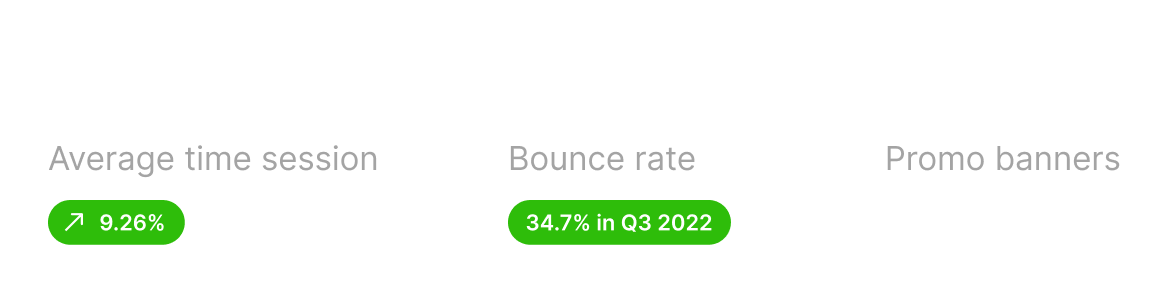
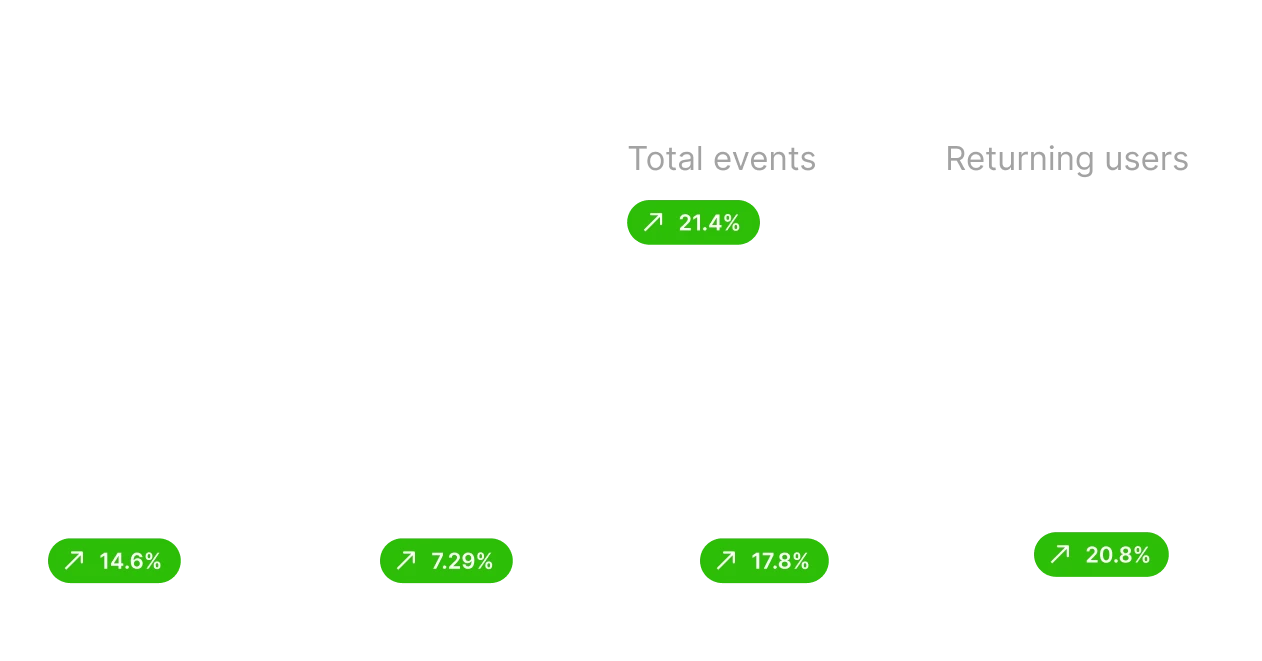
The addition of side navigation enhanced discoverability, leading to a 21.4% increase in user retention rates.
21.9%
30%
39.1%
Increase in leads

I started with mapping user behavior and needs of both platforms with Google analytics data, i mapped most used features and options with users.
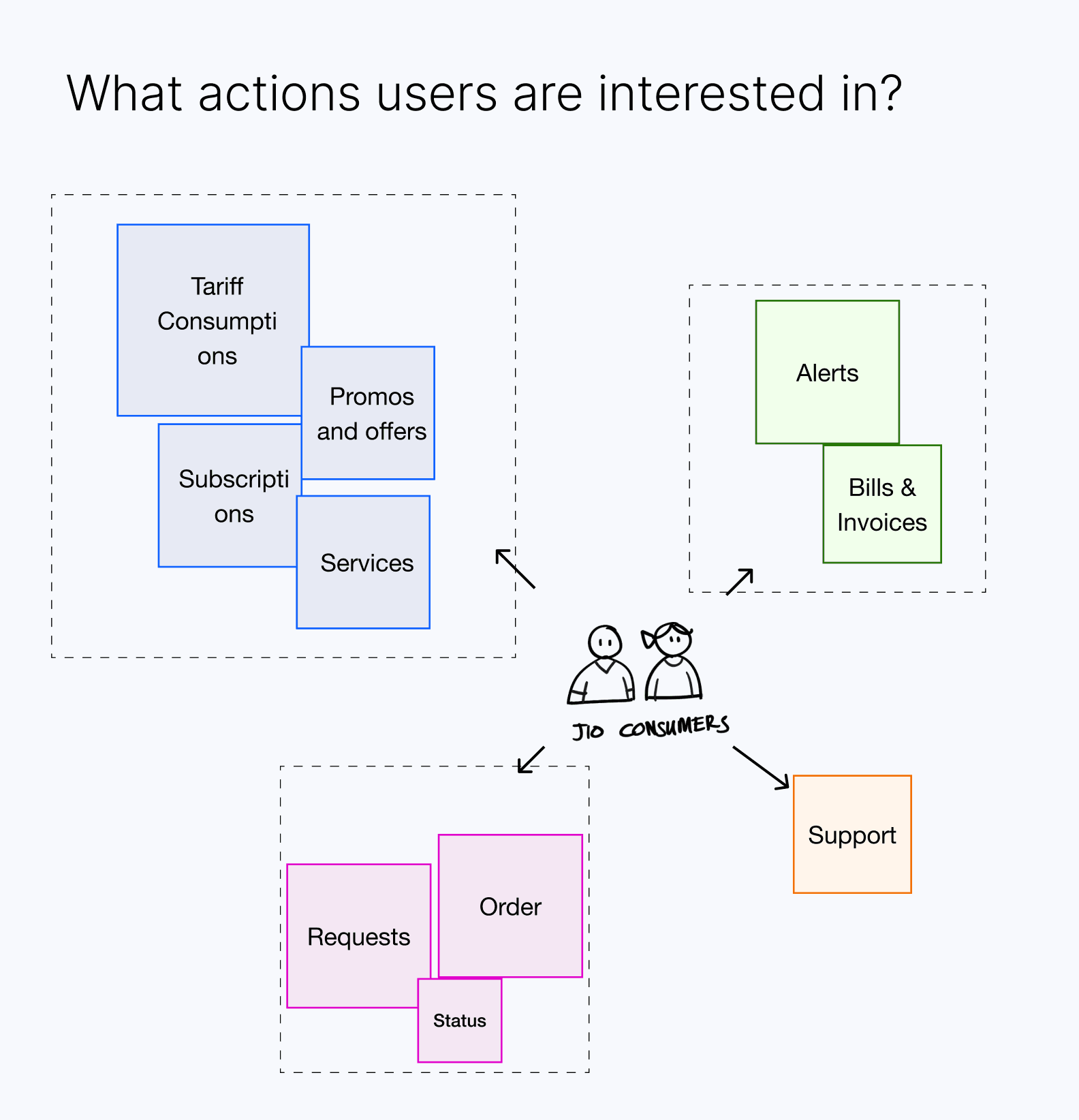

How Jio.com & MyJio work together
Users can access these features via Jio.com and MyJio mobile app, both shares some common features but also uniques features.

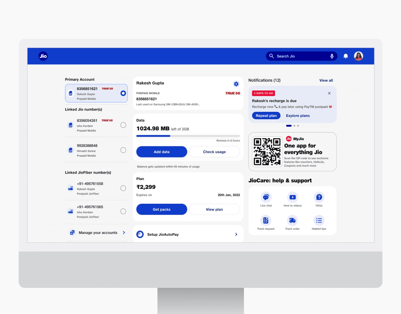
Current information design
Consumer dashboard targets users ranging from Mobile to Fiber to JioFi and JioLink. for both prepaid and postpaid users. it grew organically as product range expanded, which is why it was important to create an scalable IA for understanding.

Sorting features
After discussion with businesses and PMs, we came up with a long list of required features, considering both the tech and ecosystems of Jio.com* and MyJio*, we sorted them into categories w.r.t. different platforms.


Dashboard IA
Consumer dashboard targets users ranging from Mobile to Fiber to JioFi and JioLink. for both prepaid and postpaid users. it grew organically as product range expanded, which is why it was important to create an scalable IA for understanding.

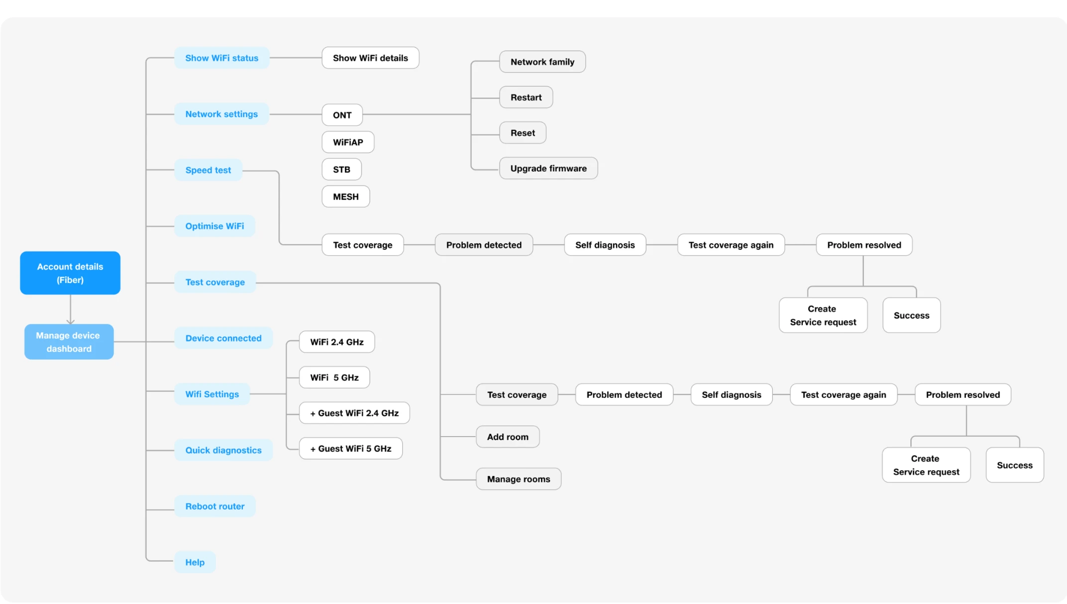

Adding Customer Support
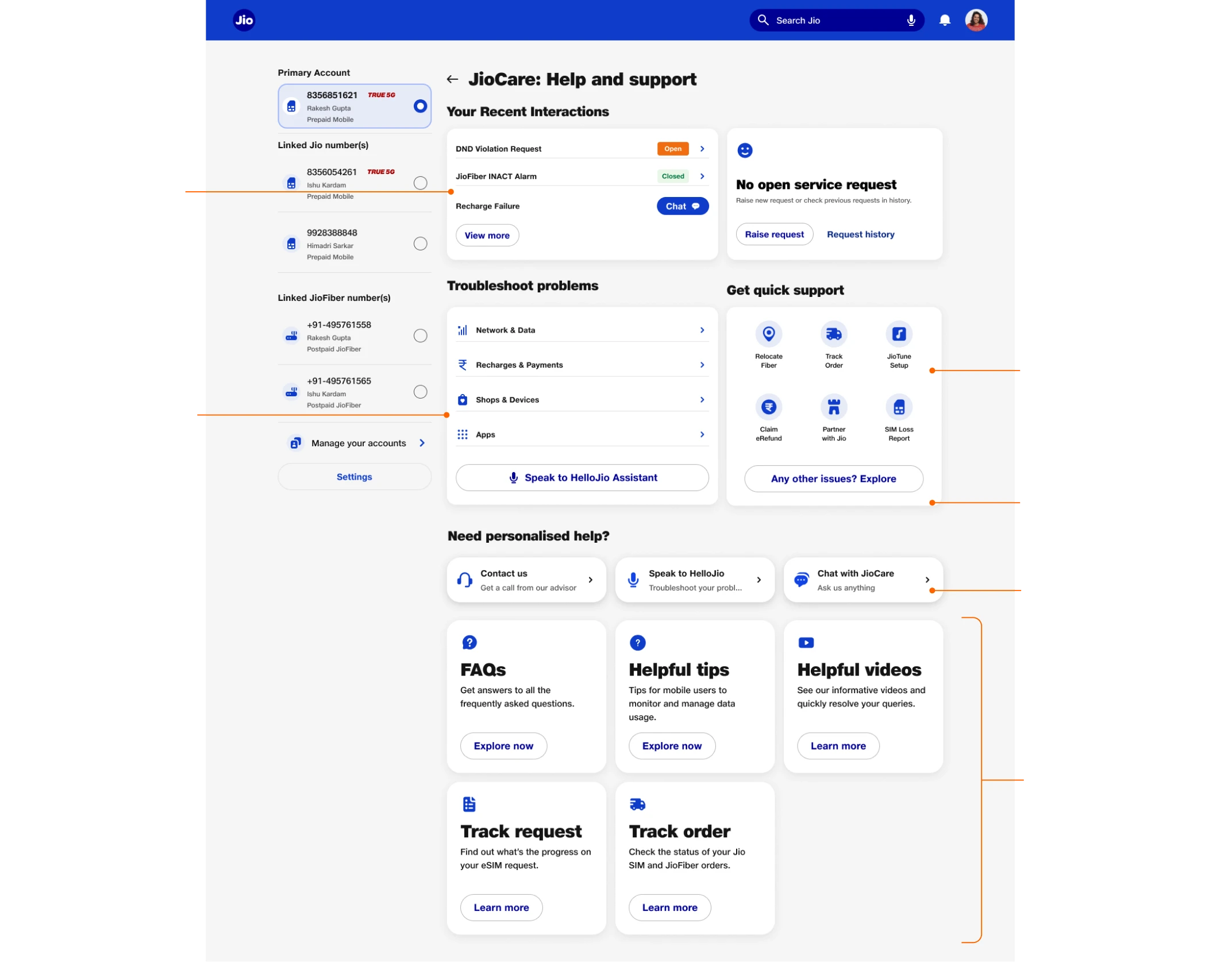
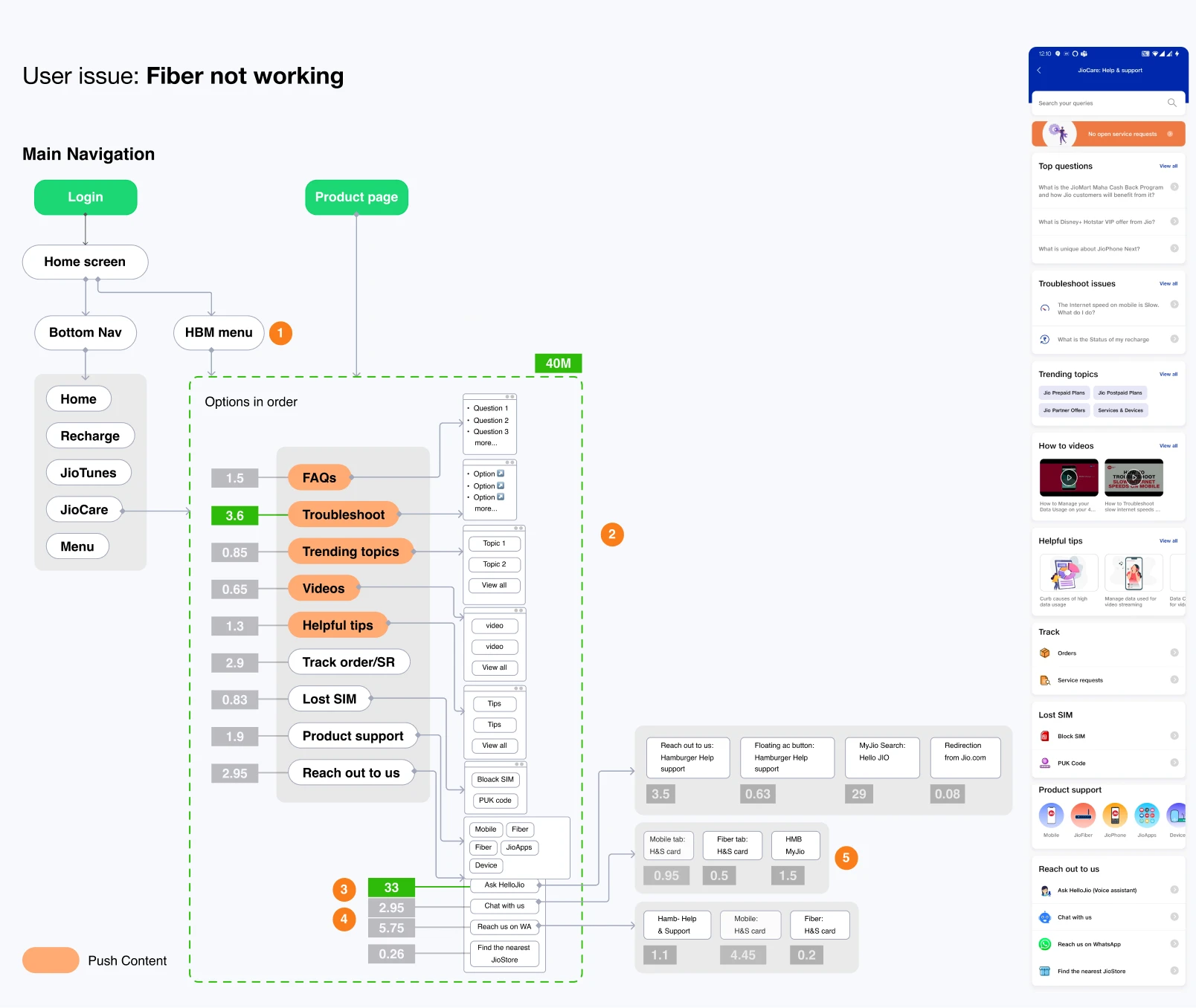
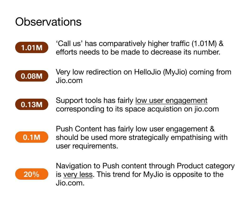
Support page on Jio.com and MyJio attracts 50k users daily, and most used features of MyJio app with 78k daily users. After assessing both app and website analytics, i checked possibilities with dev and PM team for features and restructured IA for dashboard.

Final UI: Support page